Logo
I had to consider the flexibility of logo usage for a diversity of surfaces from printed media to website and social networks.
My role:
Head of Product Design
Teammates:
1 PM | 2+ engineers
Duration:
3 Months
Challenge
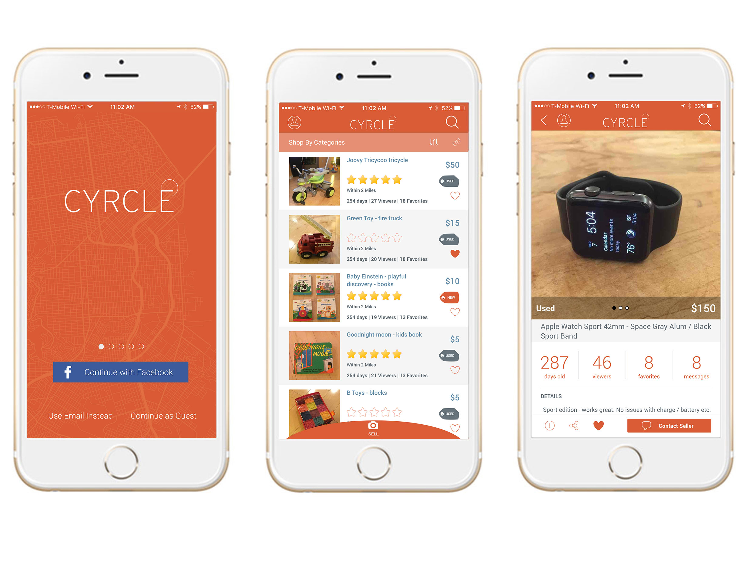
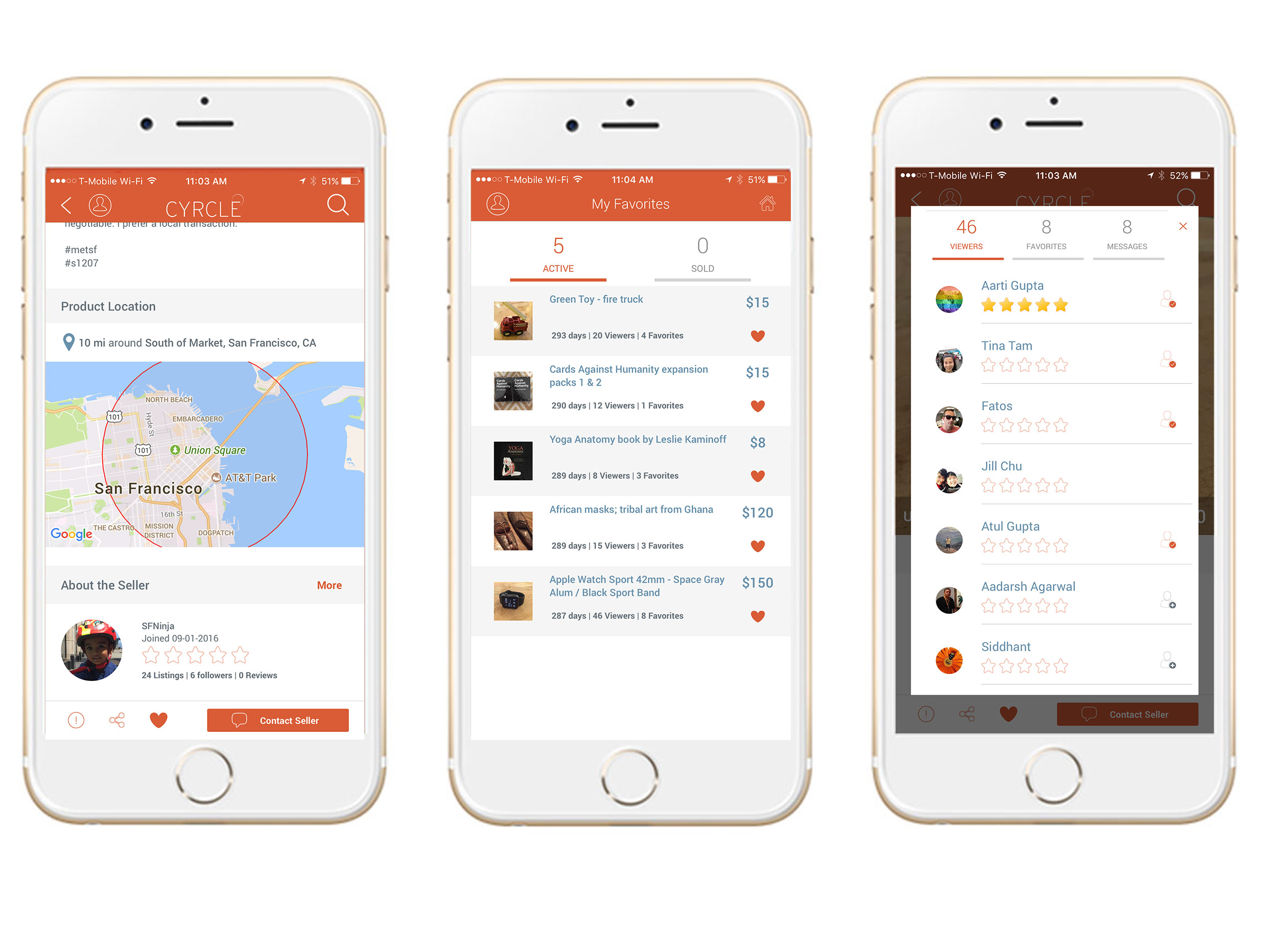
The goal was to create an app that provides an effective solution to foster local sales between end users, providng a modern, efficient, and easy to use 'Craigslist' on mobile phones. We wanted to cater to the needs of users who wanted to buy or sell products within a short distance of where they lived. We needed an app where users can list products in multiple places within their community because community provides a much needed feeling of trust and security. It also needed to cater to users looking to buy products within a budget and time frame.
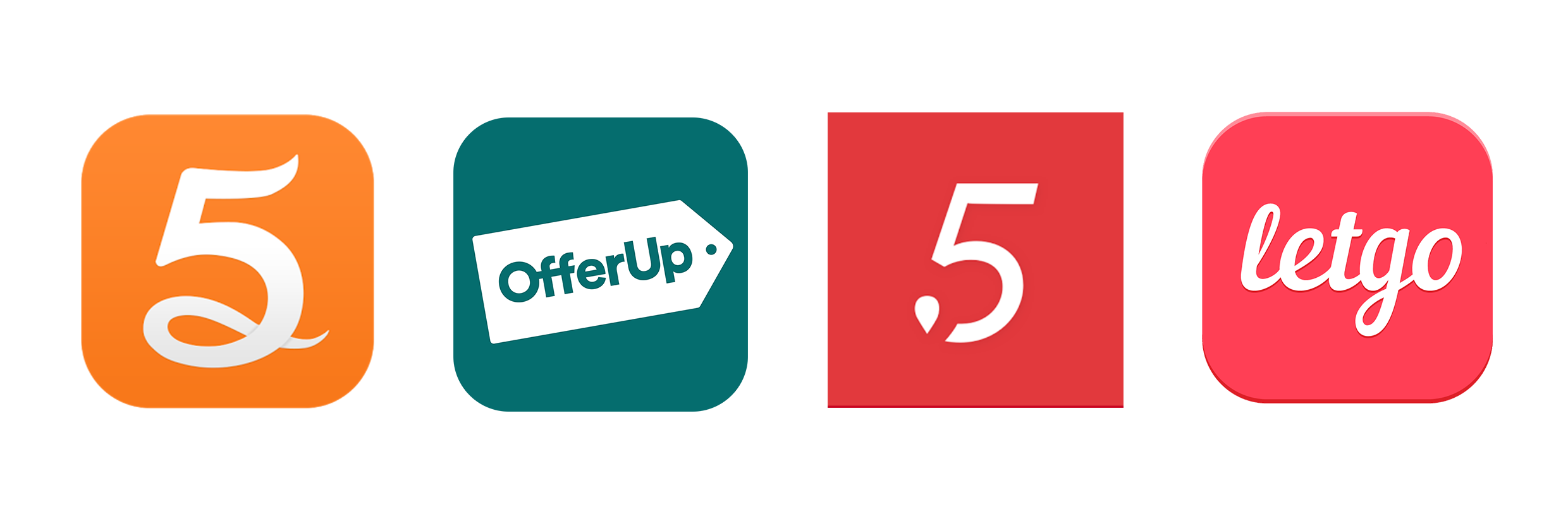
Checking out the competition
I think it always helps to look at competitors and learn from their mistakes. There were a few of existing similar products out there that I had a play with to get some initial ideas. Some of them were based on a map search with various filtering options which we thought made sense. We put some of these products in front of our friends and family to get their thoughts and feedback and to help validate our assumption that a map search approach could be a viable option for us.
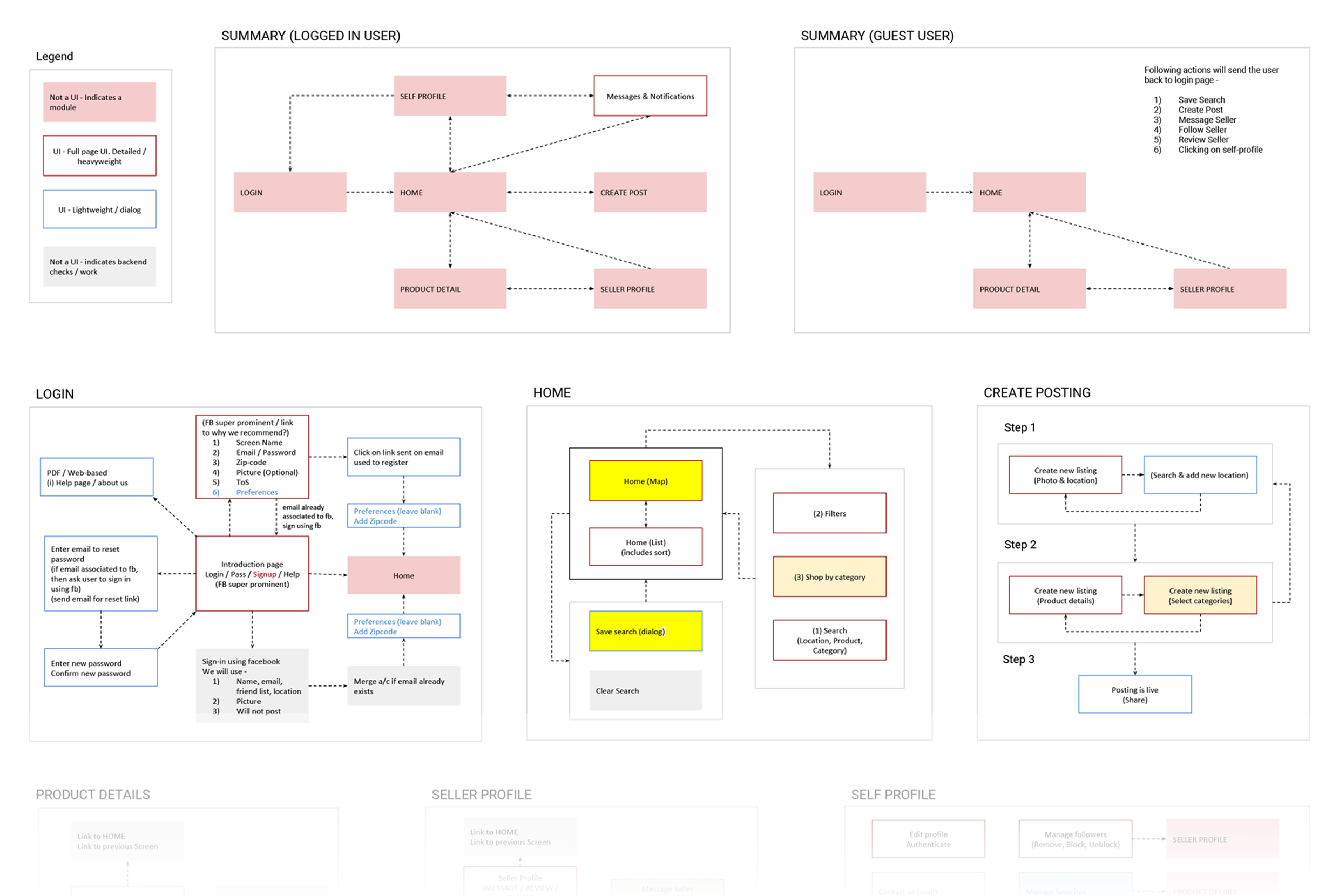
User-Flow
I created the persona based on the characteristics of the primary user group, which was analyzed to understand the major goals and frustrations of the user group, and their primary use of the website content.
Ideation
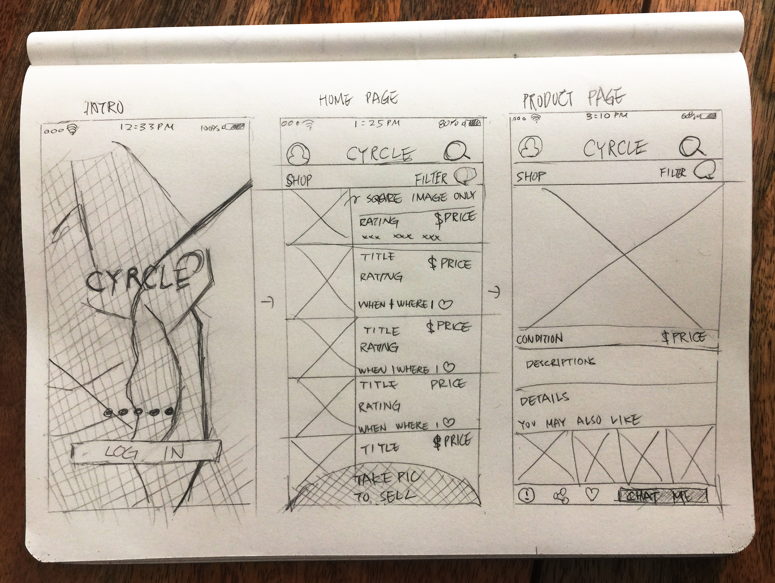
Now armed with useful insights into user needs and behaviours, I sketched out some initial ideas for what this product might look like. I knew that it primarily needed to procure for users looking to buy products within a budget and time frame. The secondary users were sellers looking to sell their stuff within community. Most users had an idea of what they want to buy and feel secure when purchase. I sketched the interface components on paper. This allowed me to quickly layout 3 key UI components that shows where, who, and how which aided team discussions and stakeholder meetings.
Low Fidelity Wireframe
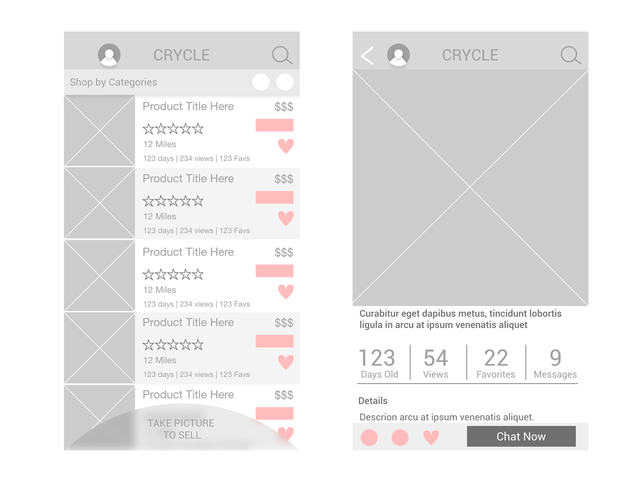
Once we were happy with the basic concept, I moved into Sketch App to add some fidelity to the design so that I could create a clickable prototype. I built a quick prototype in HTML (screenshot seen above), which gave me the flexibility I needed to create the required layout. We tested out the prototype on multiple occasions, iterating on the designs based on feedback from each session. The concept had four main parts: a map of destinations, a list of list of products, details of the product and a way to filter these products. The rest of the screens were created based on the user flow.
Implementation & User Testing
We designed and implemented this app correspondingly so we could test repeatedly in every other sprint. This way, we iterated with our design as we implemented and tested the app.
Launch & Happy customers all round
After launching the app, we had thousands of downloads and lots of positive feedback. It’s always nice to see real users enjoying a product that your team worked on.