
Oracle marketing cloud provides modern marketing solutions connecting cross-channel, content, and social marketing with data management and activation, along with hundreds of pre-integrated app and data partners. Leading brands use award-winning expertise and technology to deliver personal experiences on a proven system that marketers love and IT trusts.
Logo
Oracle's four acquired companies offer different digital marketing channel solutions. The channels record customer data. The logo combines all channels into one, singular customer journey.

My role:
Senior UX/UI Designer
Teammates:
4 PMs | 9+ engineers | Agency
Duration:
10 Months
As Senior UX/UI Designer, I worked with the PM, agency, branding, and engineering team to redesign and deliver the combined four acquired digital marketing companies (Eloqua, BlueKai, Responsys, Compendium) into one Oracle Marketing Cloud website, which achieves DAU (+ 676%), Upsell Transaction (+223%), Avg. Session Duration (+42%), Bounce Rate (- 22%), and Exit Rate (- 35%). I spent 4 months collaborating, gathering key requirements, designing and 5 months assisting the engineering team with implementation.
Background
When I joined the team, Oracle marketing cloud had individual sites from four different acquired companies. The team wanted to redesign and rebrand it to attract more customers and companies to sign up and to increase brand loyalty. The objective was to combine four acquired digital marketing companies (Eloqua, BlueKai, Responsys, Compendium) into one Oracle Marketing Cloud website that was easy to use, well organized, and provided clients with all the information they need for lead generation. The design of the website needed to be consistent with company guidelines while bringing together various products in a seamless manner.
Problem: Users have to go to different websites to sign up or find the Infomation.
Overview
Research for understand users
Interview and Observation are the two approaches used in this research. I interviewed 4 participants (3 in-person and 1 through email).The interviews explore users’ digital marketing methods, information consumption behaviors and preference as a professional marketer. I conducted in-person observation with 3 participants, which focuses on how users navigate through the websites and what their reactions are toward certain elements and content on the Eliqua and Responsys websites. For some participants, I observed their behaviors on the website, which had a similar mission with Eliqua and Responsys with a different visual style, and other websites related to digital marketing and product offerings favored by users.
Finding #1: Brand message needs to be on the homepage
Looking for the mission statement or what the organization is doing is the first thing users do when they go to a new one stop organization website. They are looking for a short and concise explanation or a slogan, and they expect to see that on the homepage.
Finding #2: Marketing and sales professionals are busy and they are looking for very useful and organized content
Marketers and sales don’t browse websites regularly because they are very busy. Instead, they search for content with specific goals. They want the information provided to be short and easy to learn. They are looking for content that is relevant to their marketing plan and they hope the information is well-organized so they can easily find what they want.
Finding #3: Marketing and sales professionals would like to sign up/ purchase new service / product when they feel connected
Marketing and sales professionals are willing to sign up add-on services that provide value to their plan, but only for the ones they feel connected and effective, such as the ones related to their marketing plan. They also need more information, such as case studies and up-coming events, to see what the organization has completed, and look for ideas for a vision for future marketing.
Participant:Users want a unified website when they look for the content and services that the organization is offering.
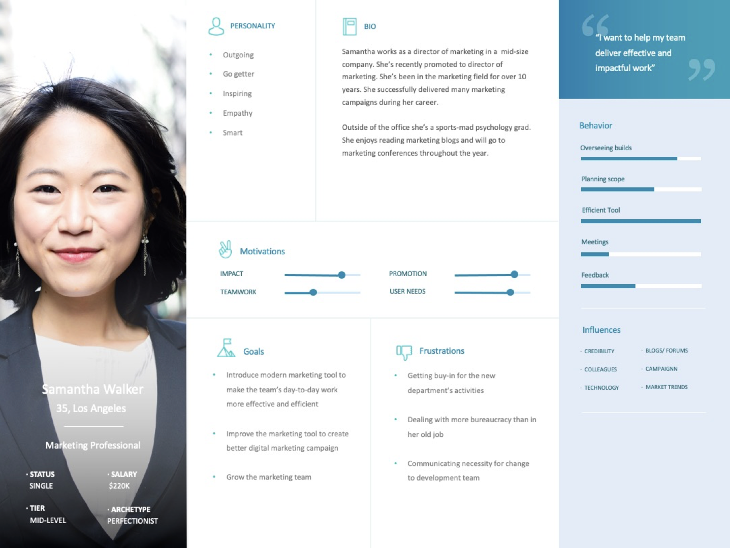
Primary User Persona
I created the persona based on the characteristics of the primary user group, which was analyzed to understand the major goals and frustrations of the user group, and their primary use of the website content.
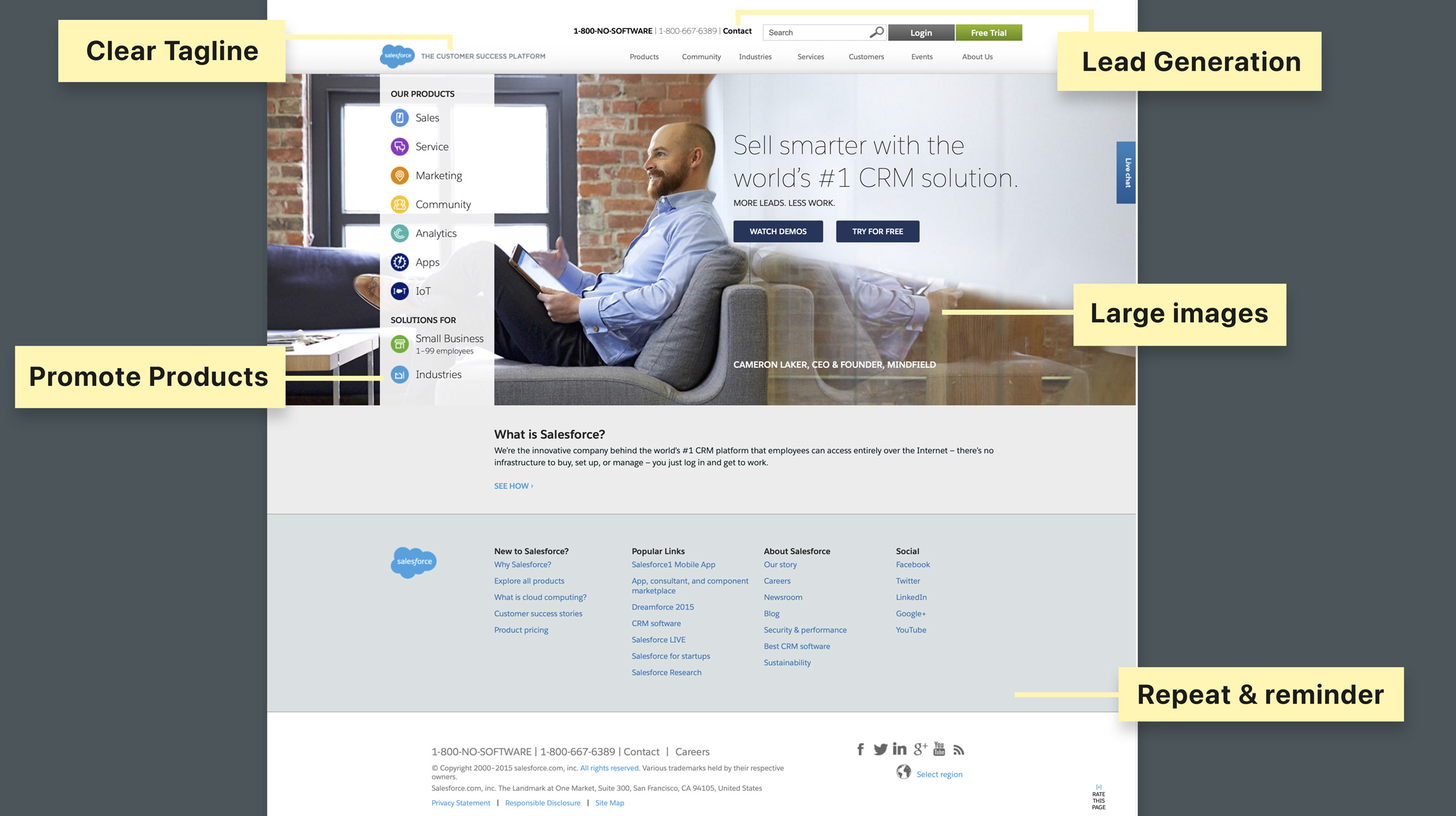
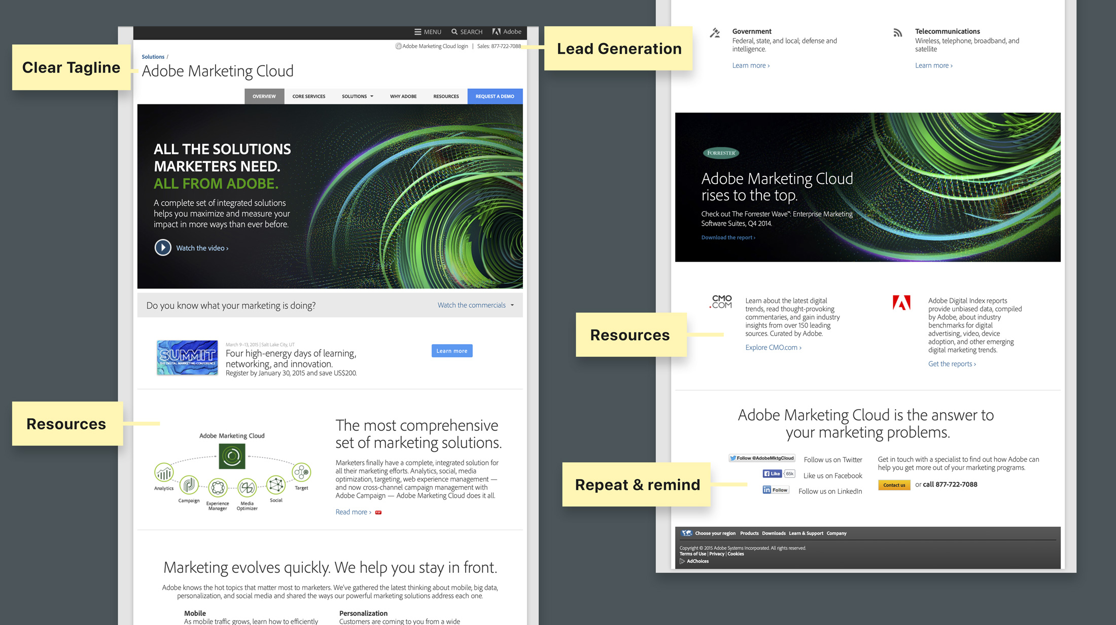
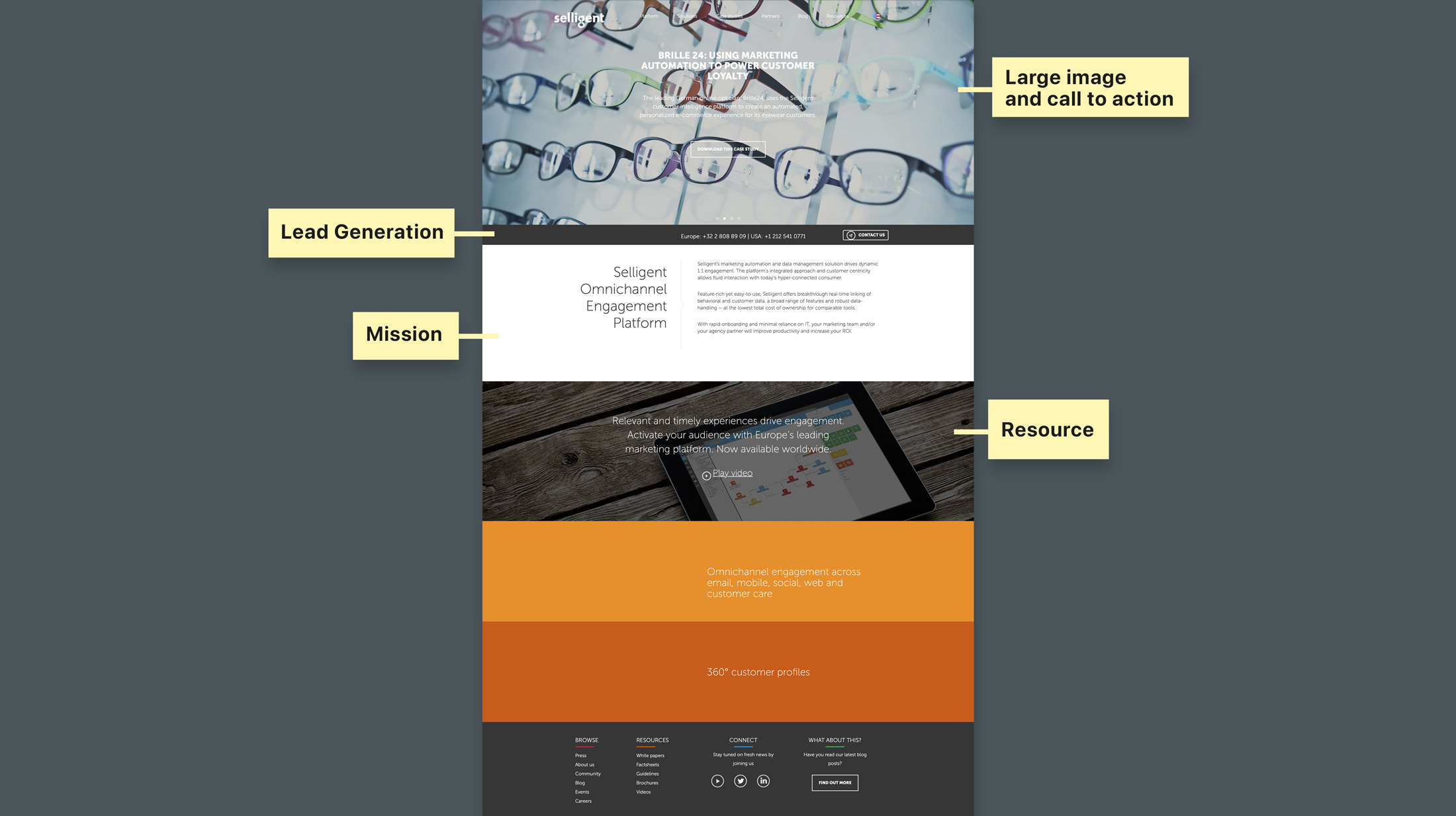
Competitive Analysis
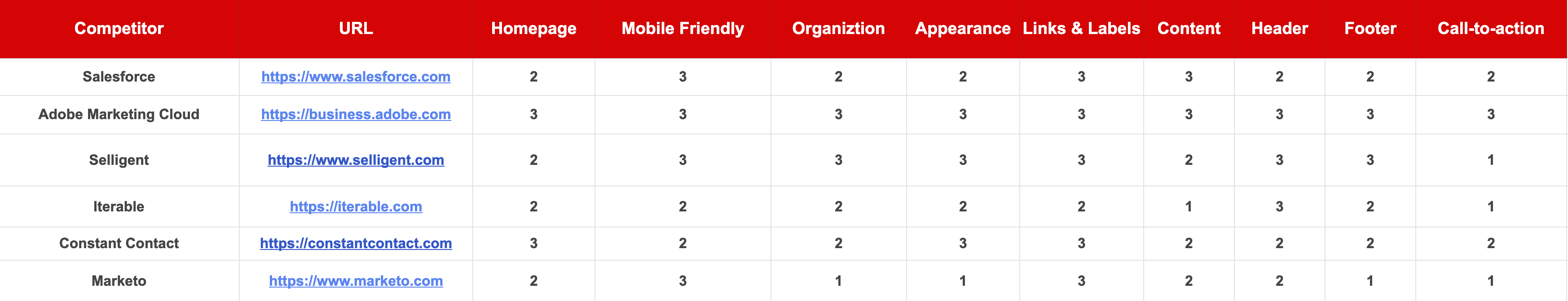
Before jumping into interaction and visual design, we conducted a competitive analysis which includes three sites with a mix of direct and indirect competitors. Our goal was to analyze and collect a visual library that included methods that show how both types of competitors organize and present their information. Bigger, well-known groups’ sites gave us insights into organizing larger amounts of information.
Salesforce
Adobe Marketing Cloud
Selligent
The site map we developed for oraclemarketingcloud.com helped to determine the dimensions for the rating matrix. The matrix rates nine dimensions per competitor. We assigned a grade of 1, 2, or 3 to each dimension, 3 being the best possible rating and 1 being the lowest score. Besides rating the dimensions, we compiled summaries, structures, and components from the sites that will serve as guides.
Structuring Content
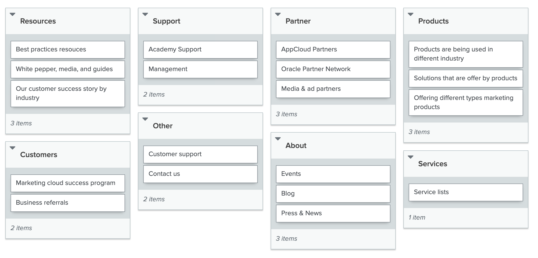
To decide the information architecture of the website, The information gathering and data analysis were performed by two kinds of testing, Card Sorting and Tree Testing, which were both conducted online with Optimal Workshop.
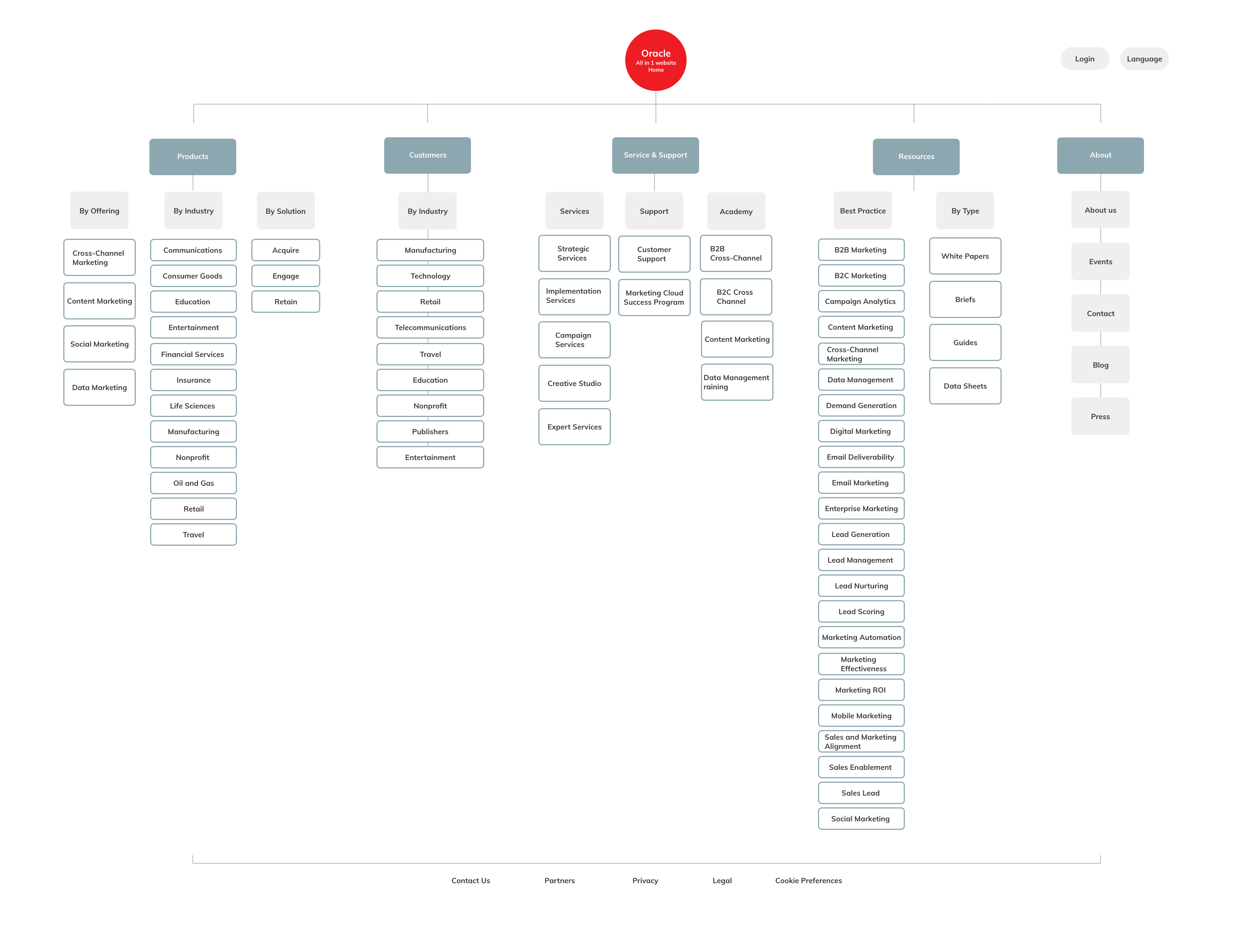
We began by administering a card sorting which the majority of participants took remotely while some were observed in a face-to-face setting. After careful analysis of the card sorting results, we were able to refine our content and structure into a tree to conduct further research with more clarity. Both tests delivered great user insight on navigation and information architecture which culminated in a sitemap for the website.
Card Sorting
We recruited 16 participants to conduct a card sorting.They sorted all 16 cards into an average of 8 groups (including the footer and the stand-alone functionality “Search”). Based on the sorting results, we identified the most commonly-used labels and groups. We used that as our primary navigation and assigned sub-categories to each label.
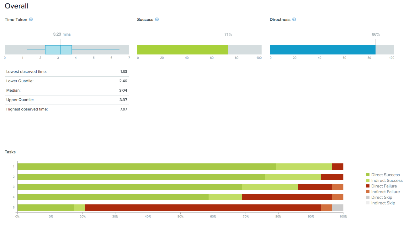
Tree Testing
After creating a new sitemap, we added the sitemap structure to tree testing, administering five tasks for users to complete, and determined whether the flow was in working condition. 32 people participated and completed the tree testing. 100% of them hadn’t been to the website before and we achieved 73% success rate across five tasks. Most participants determined it was clear, easy, and straightforward to locate the information. Only a few of them found a specific task was more difficult than others. We decided to combine the two sub-categories that were most misleading for users.
Finding #1: Users want simple navigation with fewer groups
After finishing card sorting, some users expressed that there were too many labels which should be condensed into fewer categories. Otherwise they become overwhelmed. Users group cards together in a similar manner. The primary navigation groups like “Products”, “Service”, “Support” “Resources”, “About”and “Customers” were most commonly-used..
Finding #2: Shortcuts should be placed between related pages
The tree testing informed us that users tend to go to different places to find the information. For example, some users were trying to use back-links to navigate to previous sections like “offering”, which is actually a direct sub-category of “Products”. Therefore, we want to add some shortcut links or breadcrumbs to the pages where it was relevant. This way, more users could easily find the information they want in a shorter time period.
Finding #3: Use technical and professional terms
Content marketing, the terminology used in Marketing, refers to the creation, publishing, and distribution of great content. However, we found in the tree testing that nearly 76% of users thought “Digital Content” is what helps them find the corresponding material. We determined that we should combine the information from “Digital Content” with “Content marketing,” and only keep “Content marketing.” This made it easier for most users to find the content.
Homepage
• Tell users the mission
• Offer some useful tools
• Display what’s new
• Show the number
Mobile Friendly
• Touch friendly
• Use grid, keep content short
• Mobile-friendly navigation
Organization
• Categorize sub-menus
• Add sub-navigation to sidebar
• Prominent headline
Appearance
• Simple and minimal
• Use space efficiently
• Avoid perplexing/confusing design
Links & Labels
• Include icons, visual elements
• Highlight links for navigation
• Use internal links
Content
• Provide statistics
• Recommend articles and info
• Display current initiatives
Header
• Keeping it simple
• Contact buttons
• Search functionality
Footer
• Summary of site’s contents
• Social links
• Contact buttons & email signups
Call-to-Action
• Layout with hierarchy
• Impactful imagery
• Prominent buttons
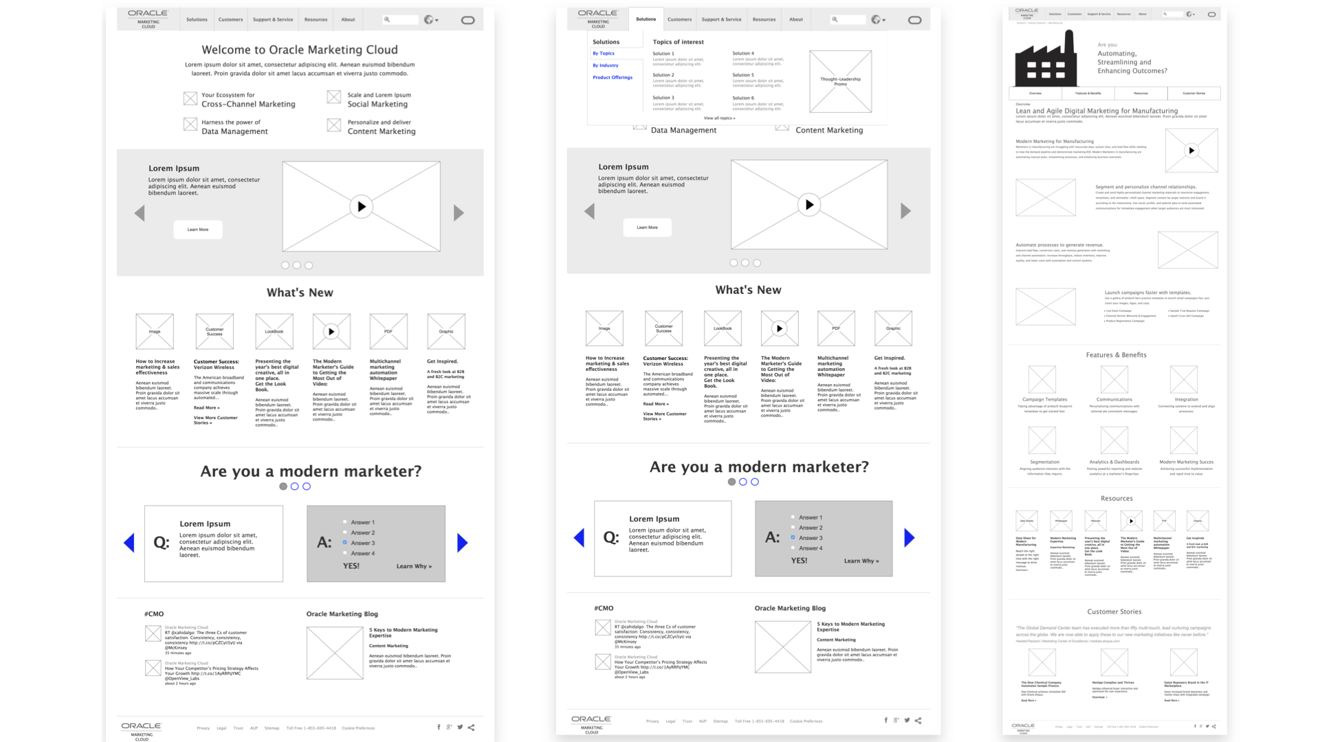
Low-fidelity Wireframe
We created low-fidelity prototypes for both desktop and mobile of Oraclemarketingcloud.com with whiteboard and sketch, focusing on the user flow of lead generation.
Prototype Evaluation
We tested prototypes with actual users. The team conducted a pilot test with a user together and each member conducted with 2 additional users individually (7 in total).
Finding #1: Text on mobile menu was too small and some users didn’t notice sub-menus under primary menu
Generally users like the location and structure of the menu on the mobile website, but some of them mentioned the text is too small. Also, some users didn’t realize when they clicked on the menu that there were sub-menus under each primary menu. To solve this, the text within the menu needed to be enlarged. Signifiers, such as arrows or triangles, needed to be added to the menu to inform users there are sub-menus.
Finding #2: The “Call” button in the header was not prominent enough
Some users neglected the “Call” button in the header, because there was no color in the wireframe and because the size of the button was not big enough. Since getting a call was one of the major goals of the website, the button needed to be more prominent but not intrusive. To solve the problem, the button was recommended to be placed at a central position and colored on the actual website. An additional calls-to-action can also be added to the middle or bottom part of the relevant pages.
Finding #3: Some pages have too much text and few images
Users complained about too much text on certain pages, such as the product page on the desktop and the product solutions section on mobile. Users prefered to see images rather than read text. They expected to see images on each screen on mobile. To improve the experience, more images or visual elements needed to be featured on the website. For example, making it sticky so potential prospects could have quick access to it.
High Fidelity Prototype
We further created the high-fi prototypes for both desktop and mobile. We focussed on ‘Locating mission statement’ and ‘build relationship’ user flows.
On the homepage, we placed a call-to-action of learning about the mission statement of Oracle Marketing Cloud on the hero image, which directed users to the “How it works” page where they could watch videos and see links leading to other information about the organization and current events.
We also listed some shortcuts to some popular content (identified by user testing of lo-fi prototypes) and the statistics of achievements to inform users more about the organization on the homepage.
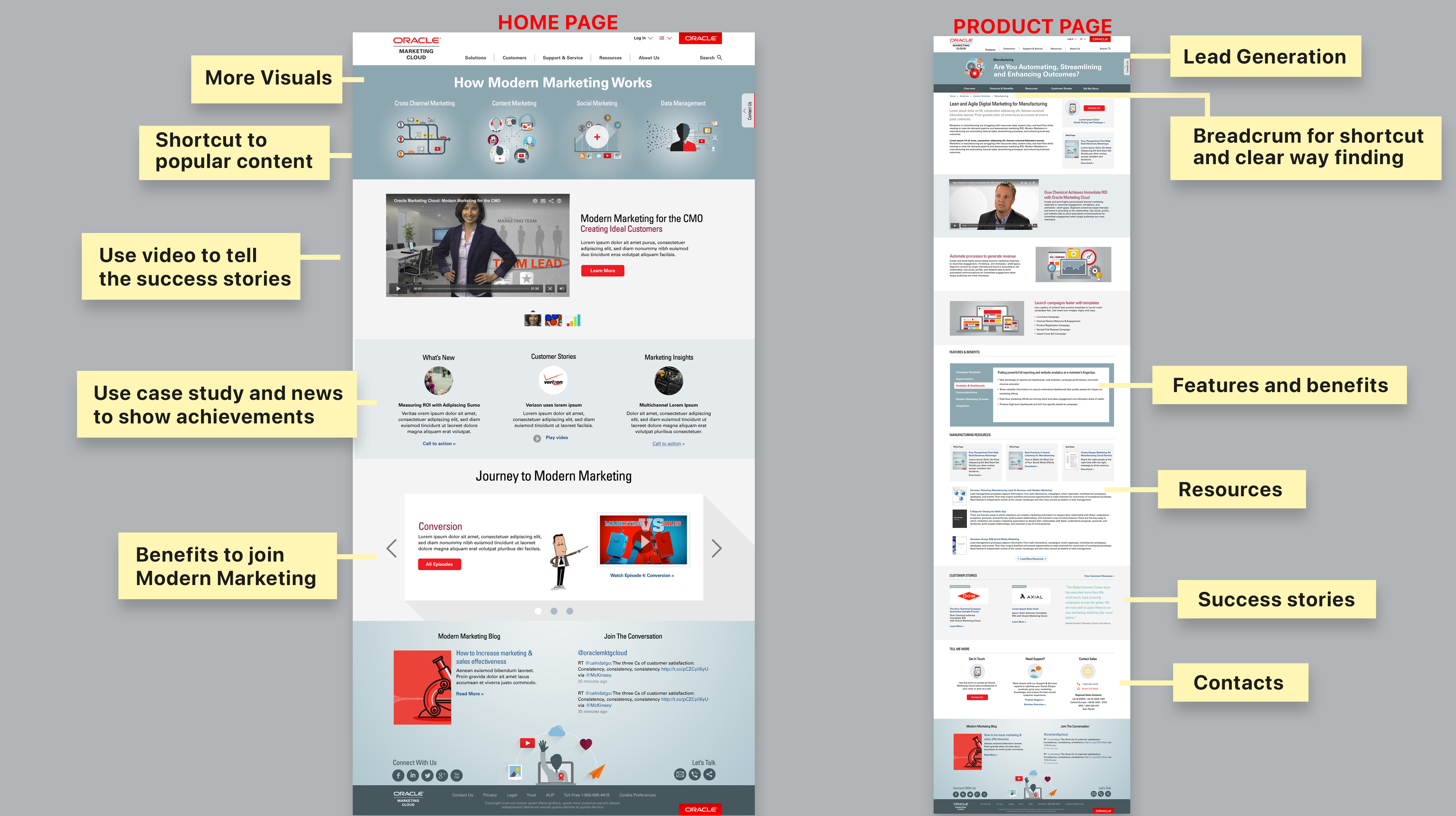
Mobile
For mobile, we focused on keeping content and appearance consistent with desktop experience and optimized the navigation and layout for small screens.

Conclusion
The design process for this project included a lot of research which informed us how users think and what users like. Understanding users should always be the first step for interactive design. With the research insights and user feedback, we were much more confident about our design decision. The high-fi prototypes are an example of how we helped the Oraclemarketingcloud.com better achieve their goals. We focused on telling the stories of the organization and optimizing the lead generation process. There are other parts of the website that could also be improved such as reducing clicks on the hero section. Furthermore, the mobile experience of browsing projects could also be further improved with the goal of avoiding too much scrolling.
+100%
Daily Active User
+100%
Avg. Monthly Orders
+100%
Customer
+36%
Avg. Session Duration
-15%
Bounce Rate
-8%
Exit Rate