My role:
Product Design Lead
Teammates:
2 PMs | 2 engineers
Duration:
2 Months
Goal
Design a site that provides smooth onboarding and documentation for visitor types targeted.
1. Create a central hub for all AMP information pertaining to Wordpress.
2. It should contain: educational information for new users, the ability to download documentation for different types of users and Central hub for all the information pertaining to the WordPress AMP plugin. The website must provide smooth onboarding and documentation for visitor types targeted.
Design Premises
1. AMP is meant to be fast, easy to use and beautiful - from the perspective of Engineers
2. Site should reflect those qualities - reflect a google product.- so design should be ‘googley’, simple to use, clean, fast. Look and feel should be minimalistic and clean - not cluttered.
3. Site should also meet accessibility standards - design elements should follow guidelines so the site is accessible.
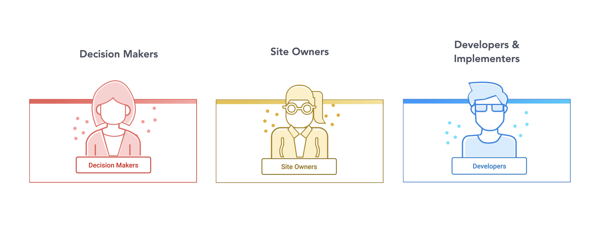
Visitor Type (Persona)
VPs
Product Owners
WordPress Site Owners
Web Masters capable of configuring a site but does not have coding knowledge
WordPress experts who don’t code but are solution providers.
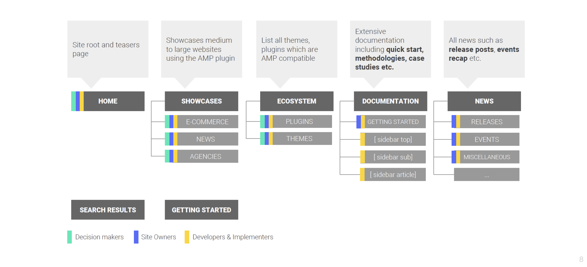
Website Structure
We break the main navigation down into 5 categories to help users predict and locate specific information. I conducted open card sort with 3 current users. They helped sort and label categories in this phase.
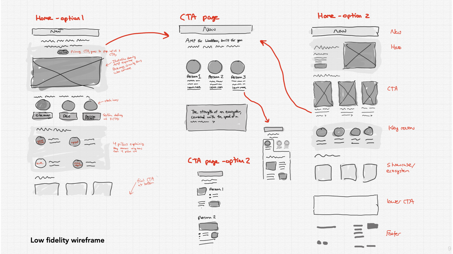
Low Fidelity Wireframe
We created low-fidelity prototypes for both desktop and mobile with whiteboard and sketch, focusing on the user flow of finding information
Prototype Evaluation
Then we tested the prototypes with actual users. The team conducted a pilot test with 4 users in total.
Finding #1: Site needs search functionality for a quick access to related content search
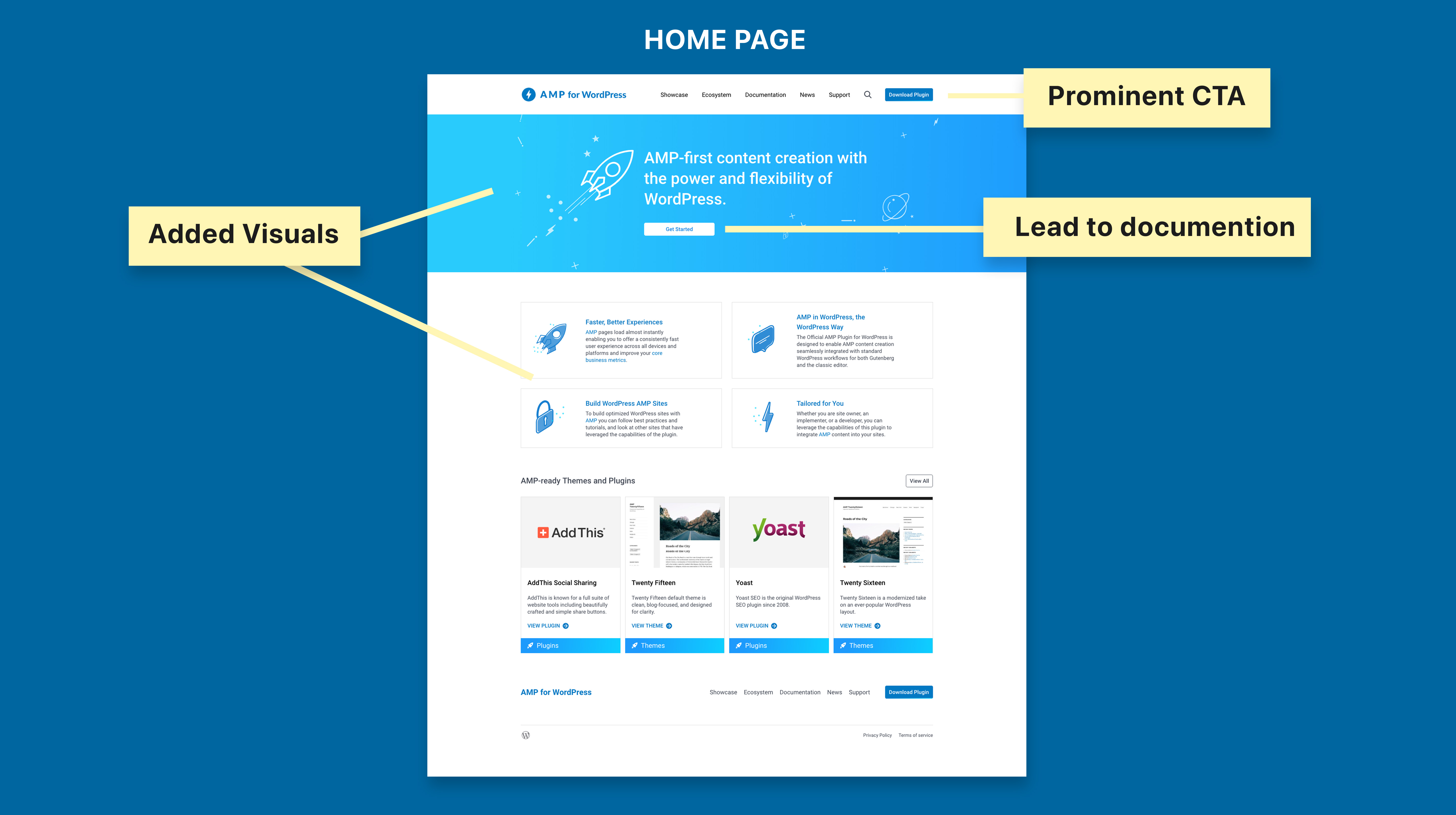
Generally, users like how navigation is presented but 50% of the time, users like to find content with related keyword search. We added search functionality for a quick access.
Finding #2: The Download button in the header was not prominent enough
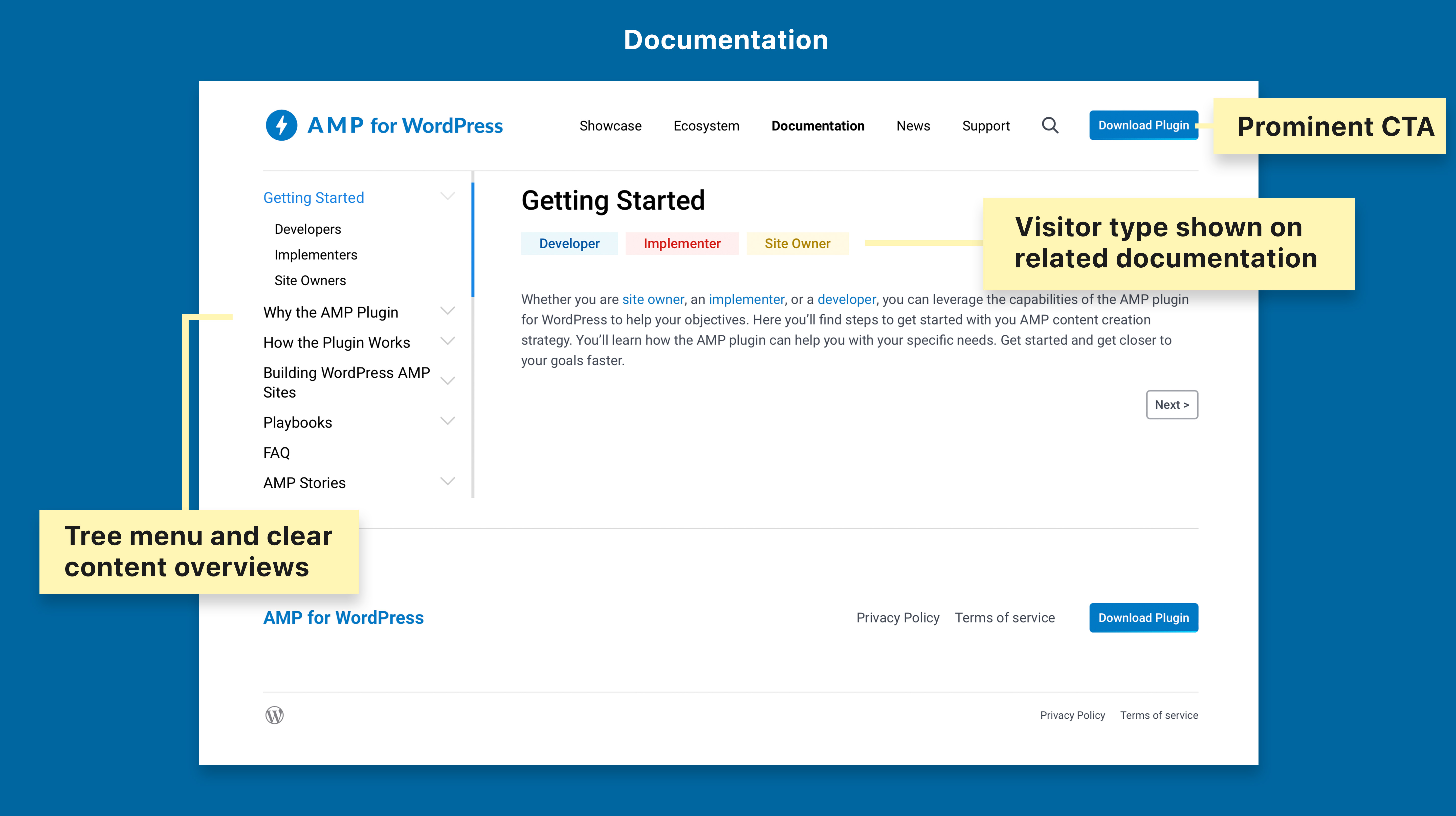
Some users neglected the “Download” button in the header, because there was no color in the wireframe, and also because the size of the button was not big enough. Since getting user to download the plugin was one of the major goals of the website, it needed to be more prominent while not intrusive. To solve the problem, the button was recommended to be placed at the top position and colored. An additional calls-to-action can also be added to the middle or bottom part of the relevant pages.
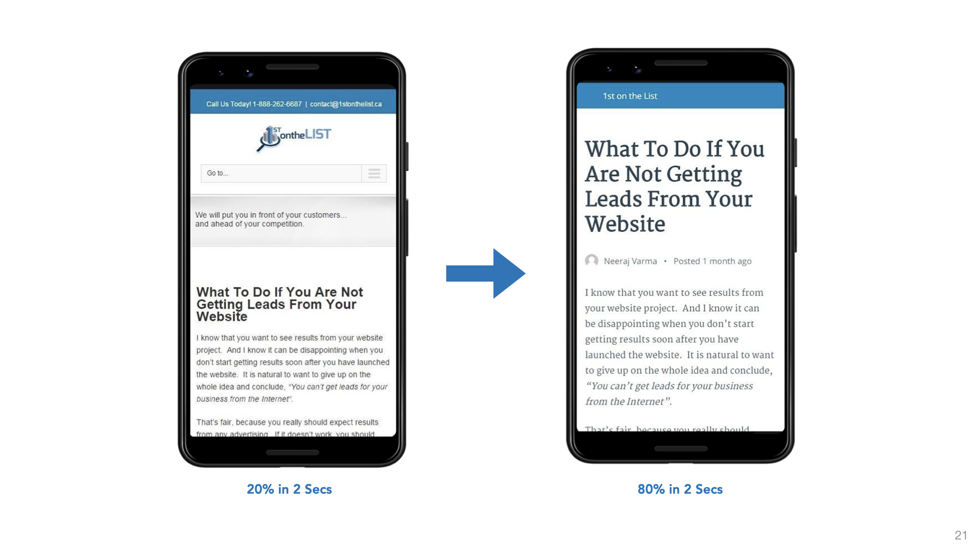
Finding #3: Some pages have to little visuals
Users complained about too much text on certain pages, such as the home page's themes and plugins section. Users prefered to see images rather than read text. To improve the experience, more images or visual elements needed to be prominent on the website. I created brand new set of illustration and icons to improve the experience.
High Fidelity Wireframe
Home page
The home page showcase features, values and the utility of the plugin to users. Site search added to improve the experience.
Documentation page
Users need to find answers to questions quickly. The design responded to this need by enhancing the documentation with tree menu and clear content overviews.
Showcase page
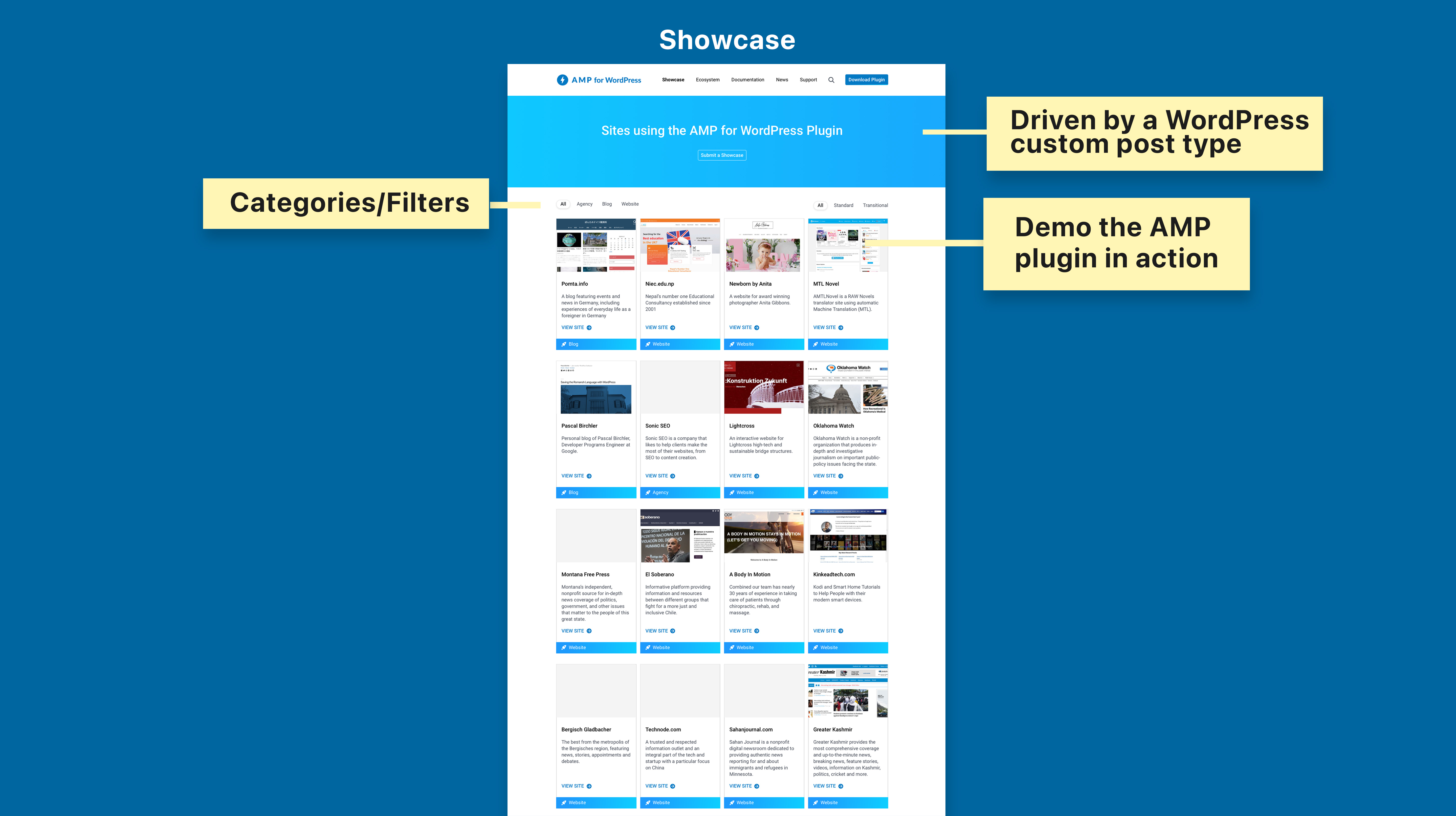
Showcase are a great way to demo the AMP plugin in action. From themes demo to large real websites, it should be engaging and showcasing AMP and the plugin capabilities
Detailed Design Process
Please contact me for a complete design presentation.
Complete Detailed Design Examples: